When it comes to ribbon design, the colors we choose can evoke a multitude of emotions and convey deeper meanings. The psychology of colors plays a crucial role in how ribbons are perceived, making it essential for designers and crafters to understand the implications of their choices. From the calming blues to the fiery reds, each hue carries its unique set of associations that can bring life and intention to any project. This article delves into the rich tapestry of colors and their psychological impacts, providing insights and practical tips for selecting the perfect ribbon hues for your creative endeavors.
Exploring the Emotional Spectrum of Ribbon Colors
Colors have an extraordinary ability to elicit emotional responses, often subconsciously influencing our feelings and perceptions. When designing with ribbons, understanding the emotional spectrum can guide you toward a more cohesive and impactful design. For example, vibrant colors like yellow and orange can inspire joy and enthusiasm, while darker shades such as navy and burgundy may evoke feelings of sophistication and seriousness. Recognizing these associations can help you tailor your ribbon choices to resonate with your intended audience or occasion.
Moreover, the impact of colors can vary depending on cultural contexts and personal experiences. What may inspire happiness in one culture could signal caution in another. Therefore, taking into account your target demographic is crucial. By exploring the emotional spectrum of colors, you can create ribbons that not only beautify but also communicate deeper emotional messages that align with your vision.
Lastly, color combinations can amplify or alter these emotional responses. The interaction of colors within a ribbon design can create harmony or tension, depending on how they are paired. For instance, combining complementary colors can evoke a sense of balance and excitement, while analogous colors can offer tranquility and cohesion. By carefully considering the emotional spectrum of ribbon colors, you can craft designs that truly resonate with their intended purpose.
How Colors Influence Perceptions in Ribbon Design
The perception of color plays a pivotal role in ribbon design, influencing how the viewer interprets the message or sentiment behind the ribbon. Studies in color psychology reveal that colors can affect mood, motivation, and even purchasing decisions. For instance, a bright, cheerful ribbon might suggest a festive occasion, while a muted, somber hue could imply a more serious or reflective moment. Understanding how colors influence perceptions can empower designers to make deliberate choices that align with their objectives.
Additionally, the context in which a ribbon is used can alter its perceived meaning. A vibrant pink ribbon might evoke feelings of joy and celebration when used in a birthday context, but the same color could represent breast cancer awareness in a different scenario. This duality underlines the importance of considering both color and context in ribbon design. Being aware of these nuances allows designers to create more meaningful and relevant projects.
Furthermore, color can also impact the way individuals connect with a design on a personal level. Many people have emotional attachments to certain colors based on their memories and experiences. By tapping into these deep-seated associations, designers can foster a sense of connection and resonance with their audience. This deep understanding of how colors influence perceptions in ribbon design can make all the difference in creating something memorable and impactful.
The Power of Blue: Calmness and Trust in Ribbons
Blue is often associated with tranquility and trustworthiness, making it a popular choice in ribbon design for conveying stability and reliability. Whether it’s a soft sky blue or a deep navy, this color can evoke feelings of serenity and calmness. When used in designs for events such as weddings or corporate functions, blue ribbons can create a sense of trust and professionalism, helping to establish a positive atmosphere.
Moreover, blue’s versatility allows it to be paired with a variety of other colors, enhancing its calming effects. Combining blue with white or silver can evoke a clean and fresh aesthetic, while pairing it with warmer tones like orange can create a dynamic contrast that remains grounded. This adaptability makes blue an excellent choice for a range of projects, from elegant gifts to sophisticated décor.
In the context of emotional well-being, blue ribbons can also symbolize support and awareness for mental health causes. By incorporating blue into your ribbon designs, you not only create visually appealing pieces but also convey messages of hope and solidarity. The power of blue in ribbon design goes beyond aesthetics; it fosters connections, builds trust, and promotes a sense of peace among those who encounter your work.
Warm Reds: Passion and Energy in Creative Designs
Red is a color that commands attention and evokes intense emotions. When used in ribbon design, warm reds can convey passion, energy, and excitement, making them ideal for celebratory occasions such as weddings, anniversaries, and parties. The vibrancy of red can infuse any design with a sense of liveliness, drawing the eye and creating an immediate impact.
In addition to its energetic qualities, red also has historical associations with love and desire. This makes it a popular choice for romantic occasions, symbolizing strong emotions and heartfelt connections. A deep crimson ribbon, for instance, can evoke feelings of warmth and intimacy, making it a fitting choice for gifts or décor that celebrate love and affection.
However, the power of red can be double-edged; it can also signify danger or caution. Thus, it’s essential to use red thoughtfully in ribbon design. Pairing red with softer hues, like pink or cream, can temper its intensity, while contrasting it with darker shades, like black or navy, can enhance its boldness. By strategically incorporating warm reds into your ribbon designs, you can harness their energy and passion to create truly memorable pieces.
The Gentle Touch of Pastels in Ribbon Aesthetics
Pastel colors evoke a sense of softness and gentleness, making them an enchanting choice for ribbon design. These delicate hues, such as pale pink, mint green, and baby blue, often evoke feelings of nostalgia and serenity. When used in ribbons, pastels can create a whimsical and dreamy aesthetic, making them ideal for events like baby showers, spring weddings, and tea parties.
The charm of pastel ribbons lies in their ability to imbue designs with a subtle elegance. They can be easily paired with other pastel shades for a monochromatic look or contrasted with bolder colors for a playful twist. The versatility of pastels allows designers to create harmonious and uplifting compositions, catering to a variety of themes while maintaining a sense of lightness and joy.
Furthermore, pastel ribbons can carry emotional significance, representing new beginnings or innocence. This makes them particularly suited for celebrations of life milestones, such as birthdays or graduations. By incorporating pastel colors into your ribbon designs, you not only enhance their visual appeal but also tap into the emotions they evoke, creating a memorable experience for the recipient.
Nature’s Inspiration: Greens and Earthy Tones in Ribbons
Green is often associated with nature, growth, and renewal, making it an ideal choice for ribbon designs that aim to evoke feelings of freshness and vitality. Whether it’s a lush emerald or a soft sage, green ribbons can enhance the organic qualities of a design, making them suitable for everything from rustic weddings to eco-friendly crafts. This connection to nature is not only visually appealing but also resonates with the rising trend of sustainability and mindfulness.
In addition to green, earthy tones such as browns and tans can ground a design, offering a sense of warmth and stability. These colors are reminiscent of the earth, making them perfect for autumn-themed projects or rustic décor. They can create a calming and inviting atmosphere, allowing the viewer to feel connected to the natural world. By incorporating greens and earthy tones into your ribbon selections, you can draw upon these associations to create a more immersive and harmonious design.
Moreover, the psychological impact of greens and earthy tones can extend to feelings of health and well-being. Green is often linked to balance and tranquility, making it a great choice for designs aimed at promoting self-care or mindfulness. By thoughtfully integrating these colors into your ribbon projects, you can inspire a connection to nature while fostering a sense of grounding and peace in your designs.
The Boldness of Black: Elegance in Ribbon Selection
Black is a color that exudes sophistication, elegance, and power. When it comes to ribbon design, black ribbons can elevate any project, making them a popular choice for formal events such as galas or black-tie weddings. The boldness of black adds a touch of luxury and refinement, allowing other colors and design elements to stand out.
In addition to its elegance, black is incredibly versatile. It can be paired with nearly any color to create striking contrasts, enhancing the visual impact of your design. For instance, combining black ribbons with gold or silver accents can create a stunning and opulent look, while pairing them with bright colors can add drama and vibrancy. The ability of black to adapt to various themes and styles makes it a staple in ribbon design.
However, black can also carry connotations of mourning or sadness in certain contexts. It’s essential to consider the message you wish to convey when using black in your designs. By thoughtfully integrating black ribbons, you can harness their boldness and elegance to create stunning compositions that resonate with the desired emotions and themes of your project.
Whimsical Whites: Purity and Simplicity in Design
White ribbons symbolize purity, innocence, and simplicity, making them a timeless choice in design. Often associated with new beginnings, white is a popular color for weddings, christenings, and other celebrations of life transitions. The gentle essence of white ribbons can evoke feelings of peace and tranquility, allowing them to blend seamlessly into a variety of design contexts.
Moreover, white serves as a fantastic backdrop for other colors, enhancing their vibrancy and presence. Pairing white ribbons with bright or pastel hues can create a fresh and airy look, perfect for spring-themed projects or lighthearted occasions. This versatility allows designers to experiment with layering and combinations, showcasing the beauty of white while highlighting other design elements.
However, the simplicity of white can also bring a challenge; it requires careful consideration to maintain visual interest. Incorporating textures, patterns, or embellishments can elevate white ribbons, adding depth and dimension to your designs. By leveraging the purity and simplicity of white, you can create elegant and sophisticated projects that resonate with your audience while celebrating the beauty of minimalism.
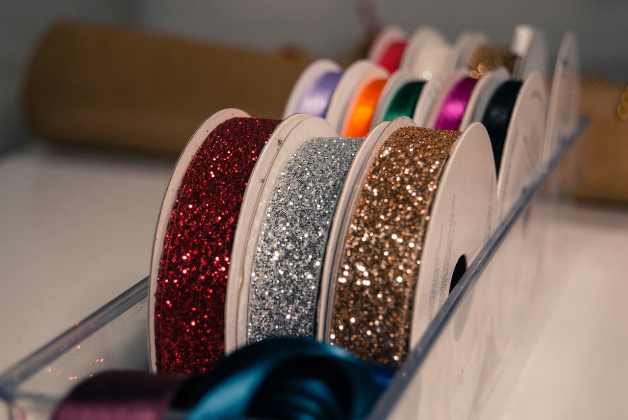
The Meaning Behind Color Combinations in Ribbons
Combining colors in ribbon design can create nuanced meanings and enhance the emotional resonance of your projects. The choice of color combinations is crucial, as different pairings can evoke varying feelings and interpretations. For instance, pairing warm colors like red and orange can create a sense of energy and excitement, while cooler combinations like blue and green can promote calmness and balance.
Understanding the color wheel can be beneficial in selecting complementary or analogous colors for your ribbon designs. Complementary colors, which sit opposite each other on the wheel, create striking contrasts that draw attention. Conversely, analogous colors, which are next to each other, provide a more harmonious and cohesive look. By thoughtfully considering these combinations, you can add layers of meaning and emotion to your ribbons.
Additionally, the cultural significance of certain color pairings should not be overlooked. In some cultures, specific combinations may symbolize good fortune or celebration, while in others, they may carry different connotations. Being mindful of these associations can help you create ribbons that resonate with your audience on a deeper level. By paying attention to the meaning behind color combinations, you can elevate your ribbon design to new heights, enhancing the emotional impact of your projects.
Cultural Significance of Colors in Ribbon Traditions
Colors carry cultural significance that can influence ribbon design on a global scale. In many cultures, specific colors are associated with traditions, celebrations, and significant life events. For instance, red ribbons are commonly used in Chinese culture to symbolize good luck and prosperity, making them popular during celebrations like the Lunar New Year. Understanding these cultural nuances can enrich your ribbon designs and ensure they resonate with specific audiences.
In addition, the use of colors in ribbons can also reflect historical and societal changes. For example, the pink ribbon has become a powerful symbol of breast cancer awareness, representing solidarity and support for those affected. In this context, pink ribbons hold emotional weight, conveying messages of hope and resilience. Being aware of these cultural significances allows designers to create ribbons that honor traditions and convey important messages.
Moreover, color symbolism can vary widely even within a single culture, often influenced by regional differences or personal beliefs. This complexity highlights the importance of research and sensitivity when selecting colors for ribbon designs. By embracing the cultural significance of colors in ribbon traditions, you can create designs that are not only visually appealing but also meaningful and respectful of the stories they tell.
Practical Tips for Choosing Colors in Ribbon Crafts
When selecting colors for ribbon crafts, it’s essential to consider the overall theme and purpose of your project. Start by identifying the emotions you wish to evoke and the message you want to convey. For example, if you’re creating ribbons for a wedding, consider soft pastels or elegant whites to reflect love and purity. Conversely, vibrant colors may be more appropriate for a festive celebration. By aligning your color choices with your project’s intentions, you can create a more cohesive and impactful design.
Another practical tip is to utilize a color wheel to explore various combinations. Experimenting with complementary, analogous, or triadic color schemes can help you discover new and exciting pairings. Don’t hesitate to mix and match different textures and materials to add depth to your designs. The interplay of colors and textures can create visual interest, making your ribbons stand out and enhancing the overall aesthetic.
Lastly, consider the context in which your ribbons will be used. Will they be part of a gift, decoration, or event? The setting can influence color choices dramatically. For example, bright, bold colors may suit outdoor events, while muted tones may be better suited for indoor or formal settings. By taking into account the context of your ribbons, you can make more informed and effective color selections that elevate your craft.
Elevating Your Projects: Harnessing Color Psychology
Harnessing the principles of color psychology can elevate your ribbon design projects, allowing you to create pieces that resonate deeply with your audience. By understanding the emotional and cultural implications of different colors, you can make informed choices that enhance the impact of your designs. Whether you aim to evoke feelings of joy, calmness, or elegance, the right colors can bring your vision to life.
Moreover, experimenting with color combinations can unlock new dimensions in your work. By thoughtfully pairing colors, you can create striking contrasts or harmonious blends that amplify the emotional tone of your designs. Don’t shy away from exploring unconventional pairings or layering textures to bring richness and depth to your ribbon creations.
Finally, remember that the journey of discovering color psychology in ribbon design is ongoing. Stay curious and attentive to emerging trends, cultural shifts, and personal experiences that may influence your color choices. By embracing this evolving landscape, you will continue to refine your craft and create ribbons that not only look beautiful but also resonate on a deeper emotional level.
Incorporating the psychology of colors into ribbon design opens up a world of possibilities for creativity and expression. By understanding the emotions and meanings associated with different colors, you can craft ribbons that communicate powerful messages and resonate with those who encounter them. From serene blues to passionate reds, each color carries its unique story, enriching your designs with layers of meaning. By applying the insights shared in this article, you can elevate your ribbon projects, creating pieces that are not only visually stunning but also deeply impactful. Embrace the emotional spectrum of colors, and let your ribbon designs tell their stories!